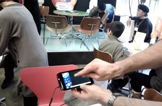
About a week ago Mozilla Japan put on a two-day event in Tokyo called Mozilla Vision 2012. It was a great weekend with several hundred people coming to talk about what it means to be Open, and, in very Japanese-style, see some cool robots (courtesy of Takahashi Tomotaka-san).

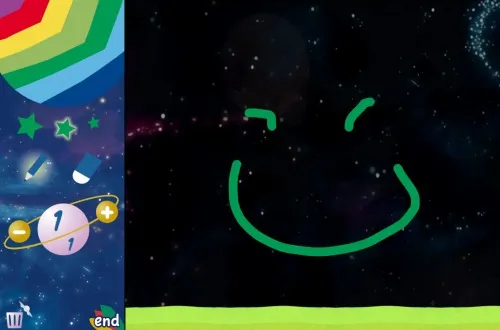
Personally, I was involved in running the Parapara Animation Workshop* where kids enjoyed drawing simple frame-based animation on a tablet which was then added to a much bigger animation projected on the walls. The purpose of the project was to teach kids the basics of animation as well as to encourage them to be not just web spectators but web makers.
![]()
It’s a workshop that was originally done by a group of Keio University Students and they helped run it again this time. The main difference is that last time it was mostly iOS-based, this time it was all Web.
Christian Heilmann has written up a great summary of this part of the program including a quick interview where you can see how it worked.

Japanese kids are really creative so it was a really fun time. But not only was the event fun, the technology side was really fun too.
Some of the technology used
- SVG—heaps of SVG. The hand-drawn paths, UI widgets, all of the animation, all of it is SVG. In particular we used a lot of SVG Animation and even SVG applied to HTML to provide the glowing effect on the form text (as per the designer’s prototype—not my idea!)
- Fennec (Firefox for Mobile)–Just a regular release build (version 9), plus Matt Brubeck’s Full Screen add-on and a few config tweaks.
- Touch events
- CSS calc
- CSS transitions
What went well
-
SVG’s native motion on a path (
<animateMotion>) saved us so much time. The auto-rotate feature (rotate="auto"), path APIs (getPointAtLength), and ability to calibrate the path length (pathLength="1") also made it easy to position animations at just the right place so they would appear on the screen as soon as the user pressed “send”. -
Using SVG made it really easy to do the drop shadows. Just a transform and a blur filter and we were done.

-
SVG animation was surprisingly fast. I expected it to be really slow but it was the fastest of the alternatives we tried. That said there’s still a lot more work to be done (see below).
-
Overall SVG just proved really versatile. Being able to show a faint greyed outline of previous frames just by setting an attribute was great. Likewise being able to do all the animation work on the client-side and then just serialise the subtree and send it to the server was so much simpler than the previous version.
-
Deployment over the Web was great. Just refresh the page to pick up the bug fixes! Likewise when we ran out of tablets at one point we could just load up the editor URL on a laptop and keep drawing.
What didn’t go so well
- The app marketplace. We badly wanted to package it all up as a Web app using the framework developed by the Mozilla Labs Apps project. We hoped that would give us full-screen display and stop the user from accidentally navigating to other pages. We had high hopes but were shattered to find the Android runtime launched the app in a Webkit runtime which didn’t even support SVG.
- Going full-screen. Due to some technical reasons we were stuck with an old version of Fennec and old UI which took some coaxing to go full-screen and stop the chrome from flying in when the user was drawing. Fortunately the bugs that stopped us from using a more recent version of Fennec appear to have been fixed so next time we can hopefully use the Fullscreen API and multi-touch for drawing with all your fingers at once (something the really young kids really wanted to do!)
- CSS and UI layout. Countless hours were sunk into trying to convince CSS to layout widgets on the screen. In the end I gave up and did half of it in script. I’m told CSS flexbox can help a lot here but I spoke to one implementer of flexbox who said that some of the things we were trying to do weren’t possible even with flexbox.
- Graphics performance. For the combined animation we badly need a boost to our SVG rendering performance. On Windows the performance was generally ok (if you don’t have a loud fan!) but occasionally got jittery. On Mac it looked terrible. We still have a way to go here. Apart from the graphics performance there’s still lots of room to optimize SVG animation itself too. For the editor running on the tablets, I have one patch awaiting review which I hope will make using SVG’s path APIs faster and speed up the drawing and erasing operations.
The result


And, of course, the code is waiting for your help at github!
Feedback
“That’s a web page?!?” I’m certain that most people who used the demo were oblivious to the fact they were using the Web and that’s probably the greatest success of this demo. Without exception, everyone who asked about the technology was surprised it was Web-based. Everyone assumed it was a native Android app or otherwise Flash.
“That’s SVG?!?” The web developers who came were also surprised at the use of SVG. Most had never really thought of making use of it. They assumed we were using canvas.
“I want to cry, this is the first time I’ve seen Fennec used for something other than reading the news”
Although a lot of the features we used are still in development it was very rewarding to see how much is already possible with Open Web technologies. We’ve had many requests to run this workshop elsewhere and, with your help, it will hopefully get better each time. Thanks very much to the Parapara Animation team and to everyone who contributed to Fennec, Gecko and the Web standards that this is built on.
* For anyone wondering what “parapara” means, it’s the sound of flipping paper and its use here comes from “parapara manga” which means “flipbook comic”. It’s also the name of a kind of hand dancing so we might have to reconsider the name so as not to disappoint the kids.
Can you write a followup post about your UI layout needs?
I think I know someone who could work on improving SVG performance :-).